01 · The invitation
A doctor with no time or money for conferences, and a project that mattered a lot to the hospital.
The audience was the general practitioner, especially in small towns — someone who sees a lot of patients with little support and has no time or budget to attend conferences. So they fall behind. Einstein wanted a continuing-education app: the doctor tests what they know, sees what the hospital considers new, and studies. The project was large and mattered a lot to the hospital. On the client side, I worked with an education and IT manager and a data coordinator, plus two more people.
I joined the project right at the start, as the Avanade designer placed at the client. The client asked for more support and, in the first week, Avanade expanded the team with my manager and two more senior people, who made a real difference at kickoff. After the kickoff and one or two more rounds of testing, they went back to other projects and I stayed in front of the product with the client's team, with my manager checking in from time to time.
02 · The research
A kickoff week heard four groups and ended with the prototype tested.
Monday through Thursday mornings, we ran 4 Design Thinking workshops with different groups: directors and managers, doctors who produce content, the education team, and client doctors who would consume the app. In the afternoons that same week, we ran a design sprint with the Avanade and Einstein teams, narrowing down ideas and prototyping. On Thursday and Friday, we tested the basic prototype with hospital staff.
4
Design Thinking workshops, with 4 different groups
2
rounds of testing: hospital staff, and days later, real doctors interested in the product
A few days later, I tested with more real doctors. With what I learned, I polished the app and got it ready for the App Store in 3 months.
03 · How I worked
Leading the app design and the design system.
I led the creation of the app's design system (the set of components and rules the team reuses) and stayed in front of the project from the second week onward, alongside the client's team. After a few months, I handed the final stretch of the app to a junior designer on the team, since the core flow was already settled. I kept leading and refining the app while the courses were still being written. I also led the Avanade design team assigned to Einstein, which grew from 4 to 8 people until the hospital set up its own design area. The principles below guide the flow I recreated for this case:
- Measure before and after: pre-test and post-test on the same topic
- "Not sure" as a valid answer, with no forced guessing
- Show what to study next, instead of a grade
- Reuse the same components across screens
04 · Solution · Entry
From the opening screen to the welcome, with 7 free days to try it.
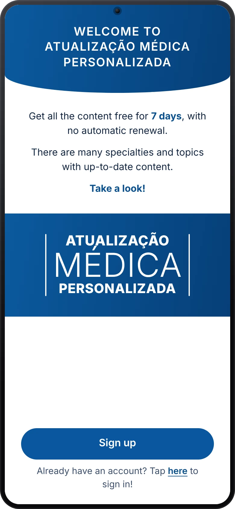
The app opens with the brand full screen and moves on to a login with CPF (the Brazilian tax ID) and password. Someone without an account sees the welcome screen: 7 days of free access, with no automatic renewal, and many specialties with up-to-date content. The promise is simple: doctors try it before committing and do not need to worry about renewal. In the prototype next to this text, you go straight to the catalog, with no login or welcome screen.
05 · Solution · Catalog and topics
A catalog by specialty and, inside each topic, the study path in plain view.
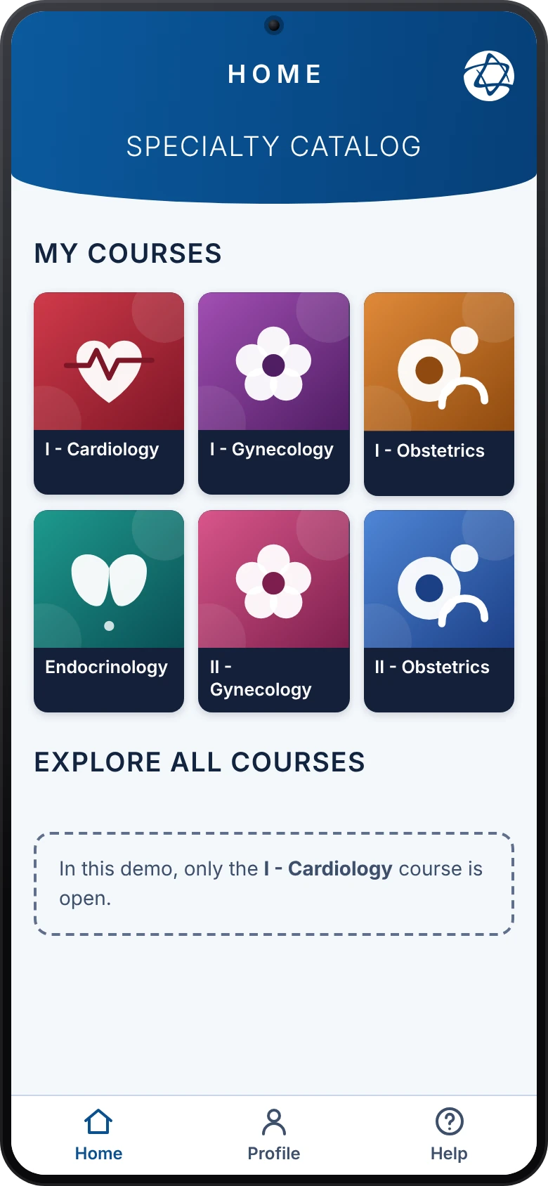
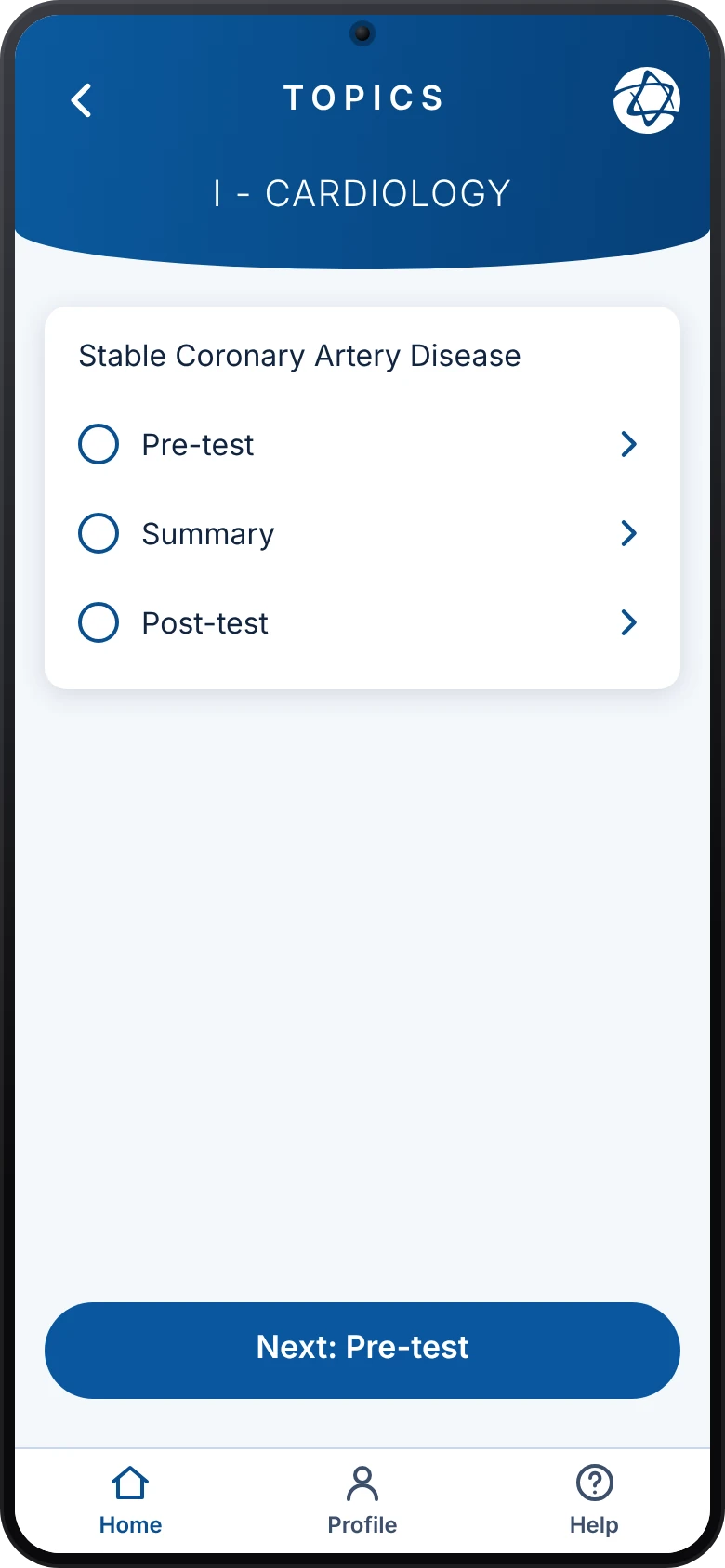
The catalog organizes courses by specialty, like a bookshelf: Cardiology, Gynecology, Obstetrics and Endocrinology. Inside a course, each topic shows its list of steps, with a mark on what is already done: Pre-test, Summary, Diagnosis, Treatment, Recap, Post-test, Practice exercises and References. The 1/6 indicator says which topic of the course the doctor is on.
06 · Solution · Pre-test and post-test
Two tests frame the study, and answering with one tap goes straight to the next question.
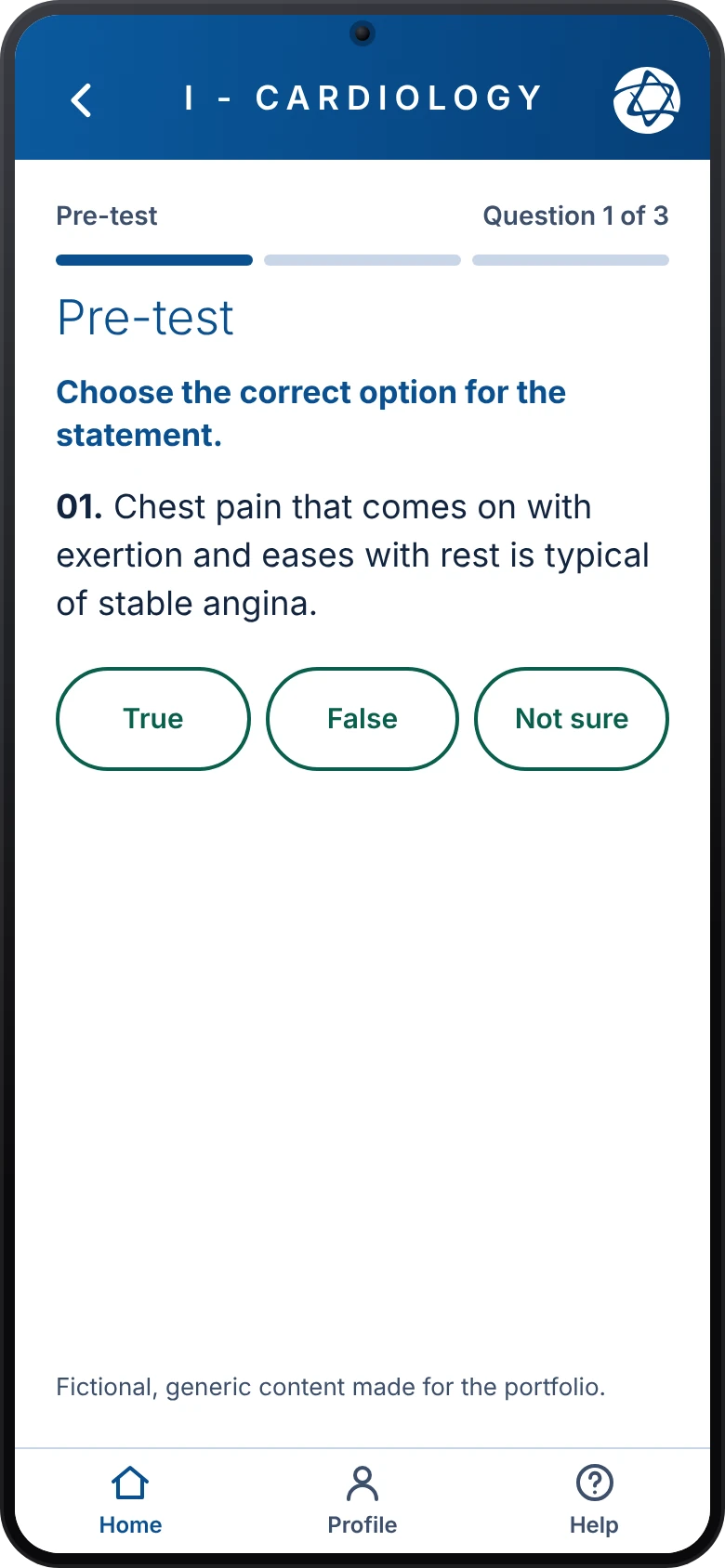
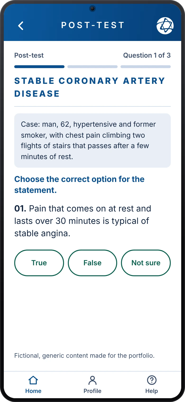
Study starts and ends with a test. In the pre-test, the doctor answers True, False or Not sure; the third option gives those who do not know a way out, instead of forcing a guess. The post-test brings a short clinical case and the same three options. In the recreation, tapping an answer moves on to the next question, with no confirm button.
07 · Solution · Study and result
The result compares before and after and points to what is worth studying again.
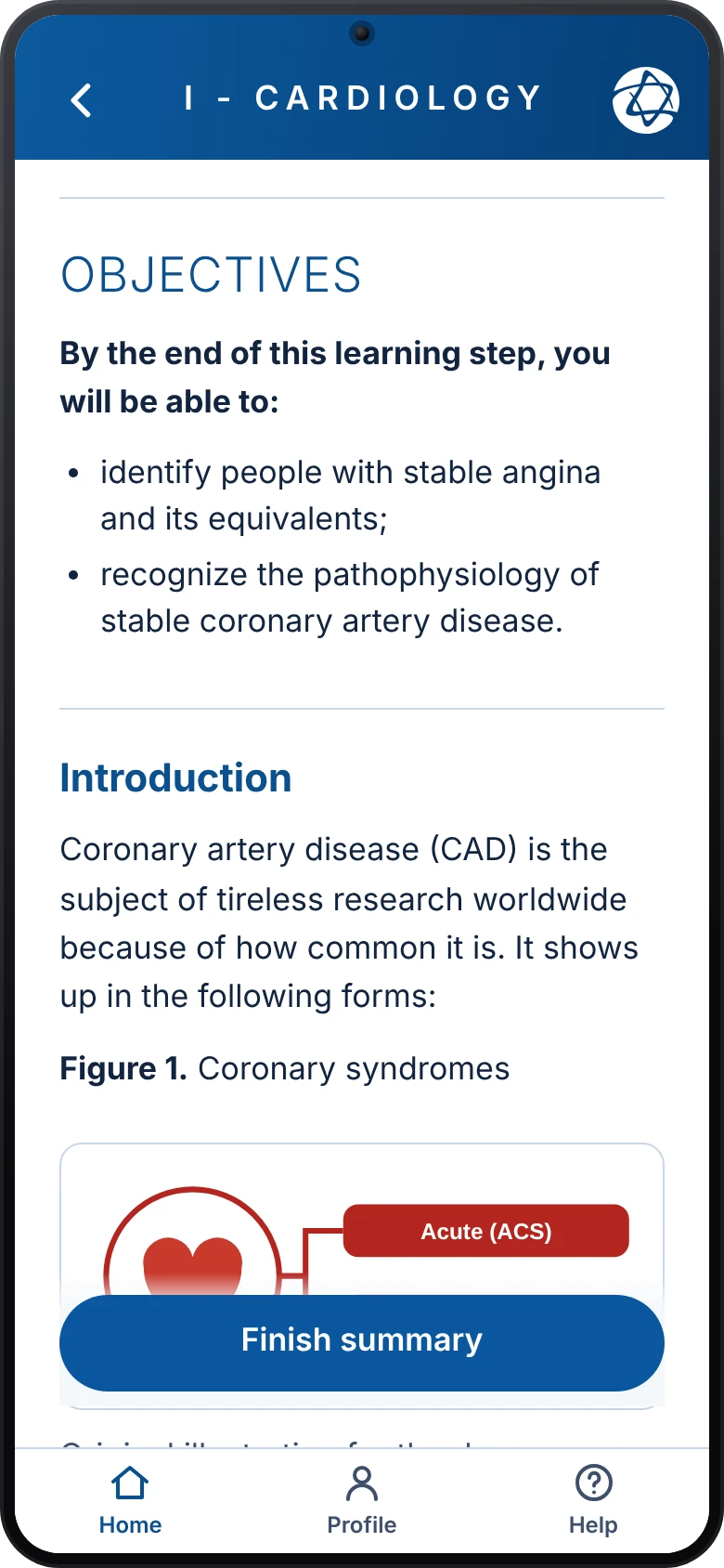
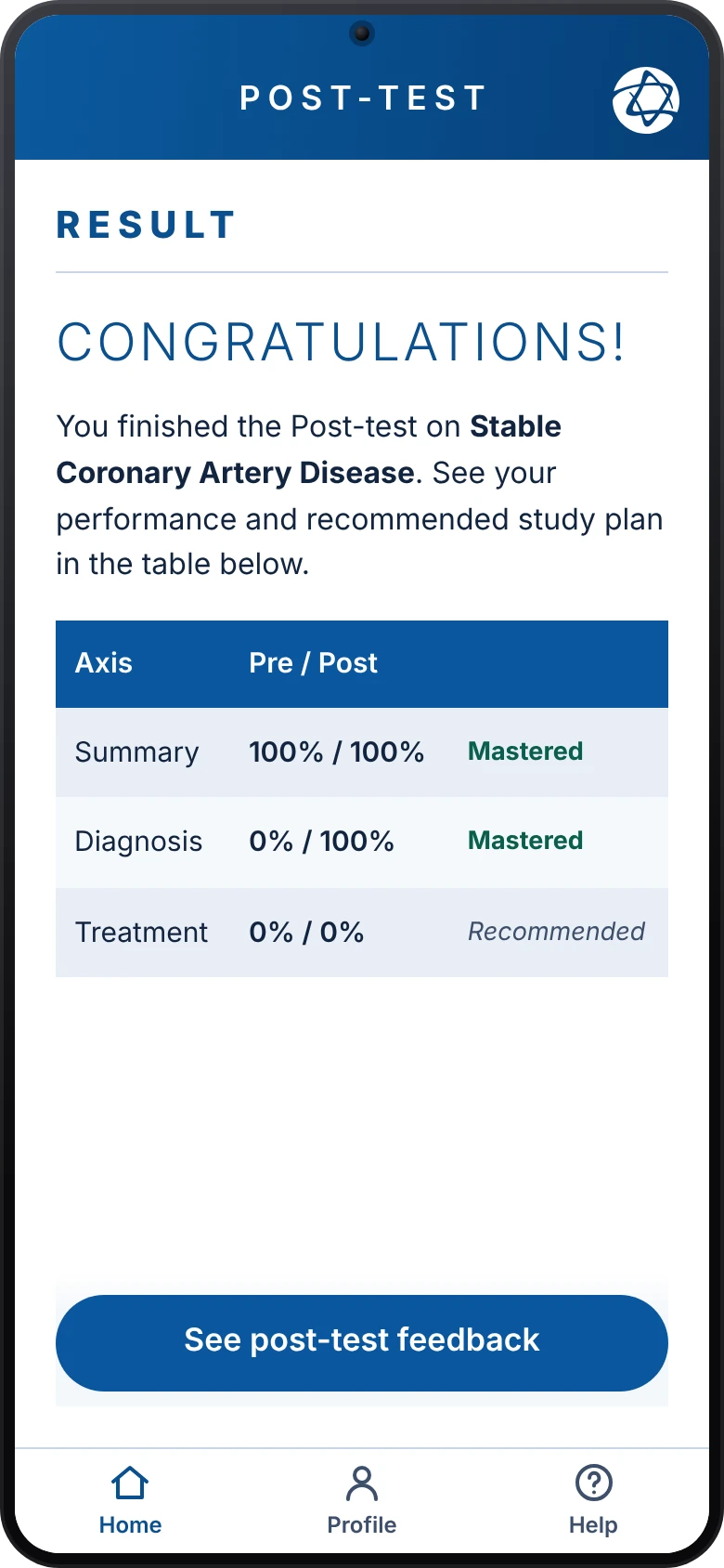
The summary opens with the learning objectives, then the introduction and figures, in text that is comfortable to read. After the post-test, the result screen compares pre and post by axis (Summary, Diagnosis and Treatment) and marks what is recommended to study again. The feedback button explains each answer. The recreation follows AAA-level accessibility: 7:1 contrast, 48 px touch targets, visible focus and keyboard use. One conscious adjustment: the original app's cyan gradient does not reach 7:1 with white text, so the blue is darker.
08 · After launch
Owners wanted a one-time payment; doctors wanted a subscription. The subscription won.
In 3 months we finished the base app and submitted it to the App Store — a soft release, still being tweaked. After that, I kept refining it while the courses were being written, through to the official launch in April, which even had a party.
During that period came the pricing debate: the product owners wanted a one-time payment; doctors wanted a monthly subscription. After a lot of back and forth, the subscription won.
This case doesn't include usage metrics, because I don't have that data.