Cross-brand selling: buy without leaving the app
A floating button brings the purchase of a product inside the app the person already uses. I imagined it for Tele Sena, inside +SBT, but it fits any app.
How the idea started
When the focus turned to growing revenue, I started asking myself: how can I, as a designer, help increase revenue? I paid attention to the subject, researched it and studied it.
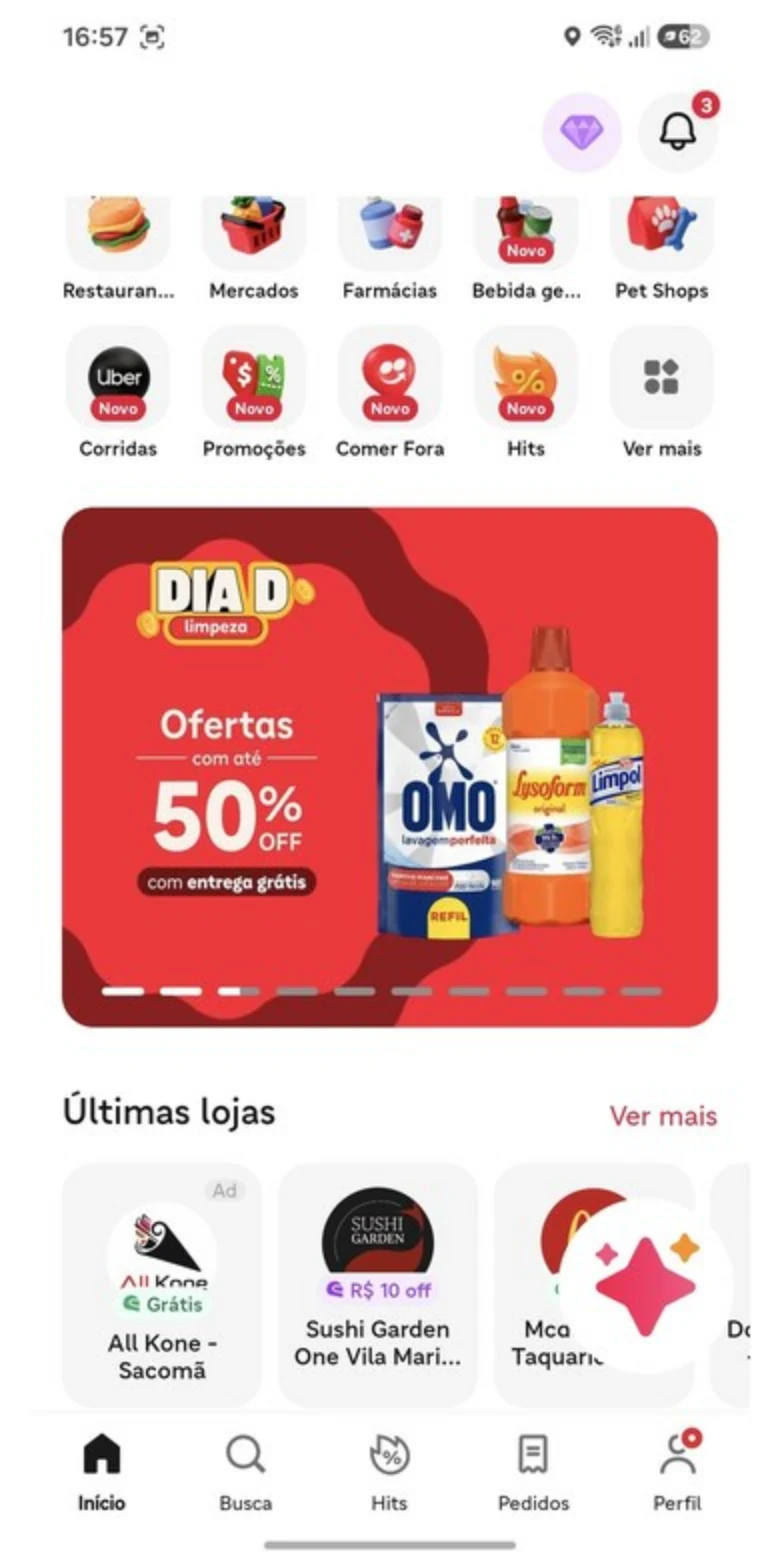
During that time I opened the iFood app, the food delivery one, and saw a floating button in the corner of the screen: a circle with a brand's logo, just above the menu, leading to a promotion. The button idea is theirs, and I thought it was great. What follows is my own proposal: it never went live and has no link to the brands mentioned. That is when the pieces fit together, and I thought: "what if I sold Tele Sena in the SBT app like this?"
External reference
The idea
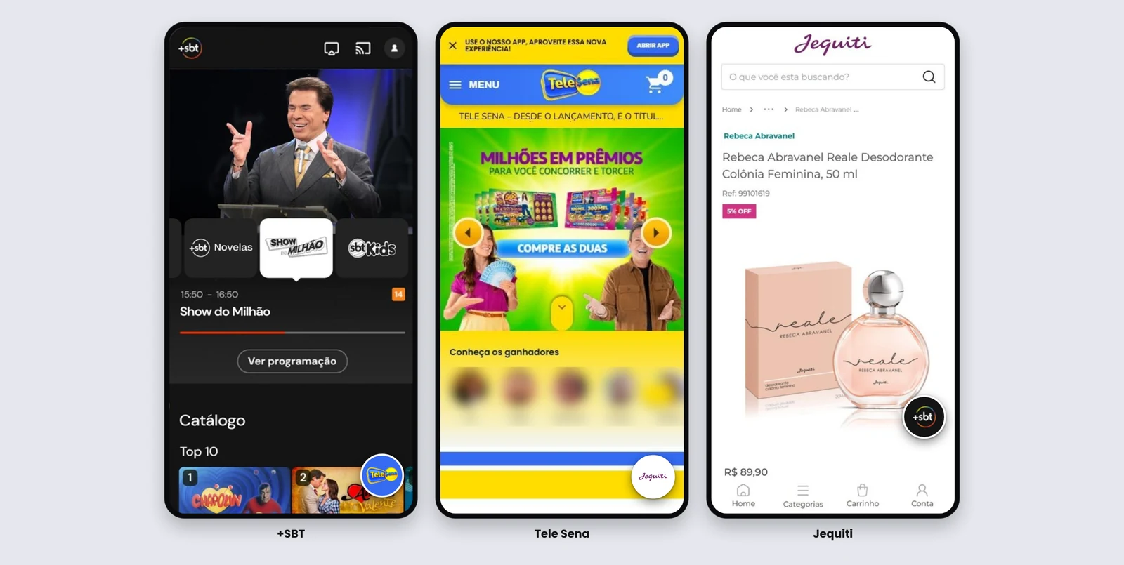
A discreet floating button in the corner of the screen, inside an app the person is already using. It offers a product from another brand. If they want, they tap it; a short window slides up from the bottom (called a bottom sheet) with the cart; they confirm, pay and go back to where they were. It is not an ad to flood people at the wrong time: it is a suggestion that is there for those who want it and goes away for those who don't.
I imagined this for Tele Sena, a Brazilian capitalization bond with prize draws. Picture someone on their phone, inside +SBT, SBT's free streaming app, choosing what to watch. In the corner of the screen, the Tele Sena button would appear. They would tap it, see the cart, pay with Pix (Brazil's instant payment system) and get a success message. Then they would go back to choosing a show, right where they were. The idea is that they never leave the app and buy in a few taps.
Interactive prototype: tap the round button and explore.
Why not ask people to scan a QR code
Today, to sell to someone in another medium, such as TV, the usual way is to show the product and ask them to point their phone at a QR code, the square read by the camera, and go somewhere else. In my assessment, that is a poor experience: it pulls the person out of the moment and takes several steps. Someone who already has their phone in hand, inside an app, should be able to buy right there.
This idea also did not come from a user pain, but from a revenue opportunity. SBT, with the audience it has, is a natural sales channel for Tele Sena. So why not let SBT sell it directly, where the audience already is?
It works in any app
Tele Sena and +SBT are the example, not the limit. The mechanic has three parts: the app where the button appears, the product it offers, and the commission paid to whoever lends the space. Any app with an audience and any product that wants to reach it fit. Just to illustrate, with a made-up example unrelated to any company: in a messaging app, a partner store's button appears in the corner of the screen. Whoever taps it sees the cart, pays and goes back to the chat, and the messaging app earns a commission on the purchase. Swap the messaging app for a bank, a delivery app or a game, and the store for an insurance policy, a grocery or a course: the mechanic is the same.
When several apps in the same group do this, a loop forms. In the SBT group example, it starts with three products: +SBT, Tele Sena and Jequiti, a cosmetics brand. +SBT shows the Tele Sena button. The Tele Sena app shows the Jequiti button. And the Jequiti app shows the +SBT one. Each one sends the person to the next, and the loop closes.
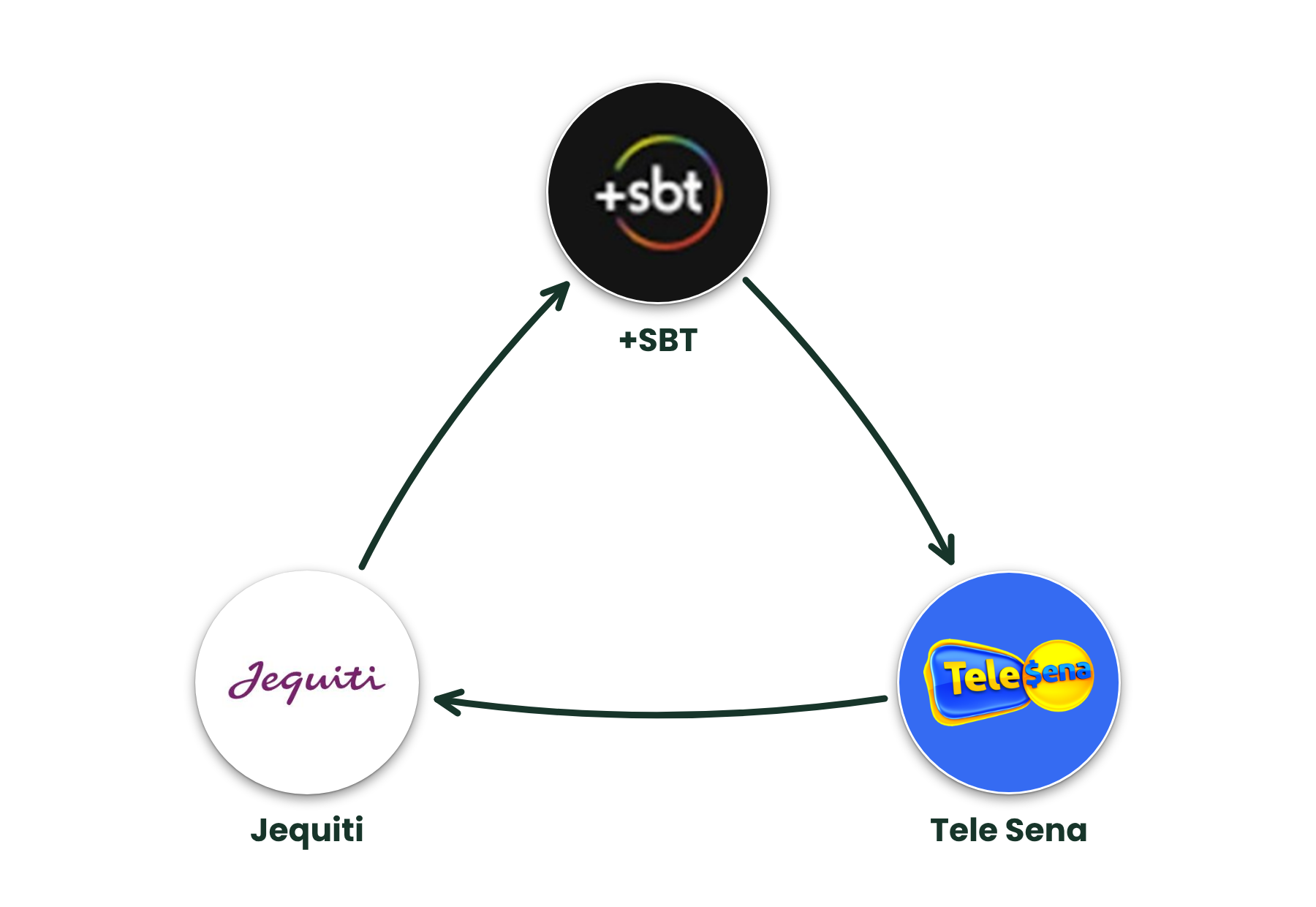 (open full size)
Who points to whom is not fixed. It changes with the needs of the business, and other brands can join the loop later.
External reference
How it makes money
Every purchase made through the button could earn a commission for whoever lends the space. In the example, SBT would start selling on its own channels, where the audience already is, and the brand that receives the sale would pay for it. As an example, 2% of each sale.
Safeguards
For the button to help and not annoy, I would propose:
- showing only to logged-in adults (18+), with age checked at sign-up;
- making clear it is an offer from another brand, with the brand in plain sight;
- showing price, rules and what is being bought before payment, with no false urgency or countdown;
- making it easy to dismiss and to switch off, with a limit on how often it appears;
- never covering the main screen controls, such as the video player, if there is one;
- a touch target of at least 44 px, AAA contrast, a clear name for screen readers, a sheet reachable by keyboard and animations that respect "reduce motion";
- only sharing data across brands with clear consent, under Brazil's LGPD privacy law, and keeping the commission transparent.
If the product on offer is regulated or involves prize draws, such as capitalization, insurance or credit, the offer inside the app has to follow the advertising rules for that kind of product, and someone who knows those rules should validate it before any test. Tele Sena, in the example, is a capitalization product.
What I would like to measure
If this idea were tested, these are the numbers I would track and what each one shows:
- Tap rate (taps ÷ people who saw the button): shows whether it catches attention without getting in the way.
- Conversion (completed purchases ÷ taps): shows at which step people give up, the sheet, Pix or the confirmation.
- Time to complete the purchase: if it takes more than a few seconds, the flow is too long.
- Time spent in the app before and after: makes sure selling does not undermine the reason people are in the app.
- Button dismissals: if they go up, we are annoying people, and the fix is to show it less.
- Revenue per thousand sessions: compares the commission earned with the cost of building and maintaining it.
- Cross-brand purchases: people who bought through one button and later buy from the other brand, a sign the loop works.
What do you think?
Do you have an app with an audience, or a product that wants to reach one? Write to me, I would be glad to talk.